
Telephone Keypad Design
 |
Have you ever thought "Why are the numbers on a telephone keypad arranged the way they are?" “Why are the numbers on a telephone keypad arranged the way they are?” |
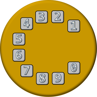
Why are they arranged in a 3x3 grid with the zero below? How did this layout become a standard? Why is this layout subtly different to the way the numbers are arranged on a calculator or numeric keypad? What other layouts were considered?
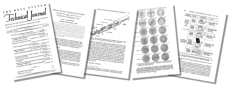
The answers to these questions can be found in a fascinating piece of research performed by AT&T in 1960. I strongly encourage you, if you have time, to read their entire publication on the subject. A summary of this work was published in the July 1960 edition of the Bell Systems Technical Journal.
The article was entitled: Human Factors Engineering Studies of the Design and Use of Pushbutton Telephone Sets. You can download a copy of the article here [PDF].
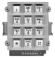
This classical piece of research covers four aspects of the keypad design: Key arrangement, Force displacement characteristics, Button top design, and Central office factors. The outcome of this research project and testing is the keypad we know today. In my blog posting I'm going to summarize just the results the key arrangements. For details of the other criteria and decisions refer to the article.
Ring, Ring …
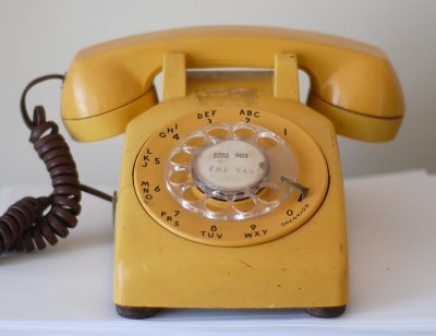 Image: Billy Brown Image: Billy Brown |
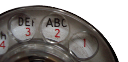
First of all we need a little history. Telephones used to have rotary dials. This is how numbers were selected. Interestingly, we still use the verb "Dial" to describe the action we perform when we use a phone to make an outgoing call, even though modern phones do not have dials! Also a phone still "rings" when it needs answering, even though it does not have a bell inside. |
|
The vernacular goes even further back! We still "Hang up" when we want to terminate a call, and this refers to the action of placing the receiver back onto the hook of a phone that was shaped like a candlestick! Old technology phones used to dial numbers through a series of pulses. This process is given the name "Loop Disconnect". To select a number, a finger was placed in the corresponding hole of the dial, and then the dial was manual rotated clockwise (against a torsion spring) until the finger pressed against an end stop. The finger was then removed and the spring would return the dial back to the mean position at a damped uniform angular speed. For every digit position that the disk rotated backwards an electrical circuit was momentarily broken and then made again. This created a train of short pulses (affectionately know as 'clicks'), and sequences of these click trains (with short gaps in-between) was the mechanism used to encode the desired number. |
 |
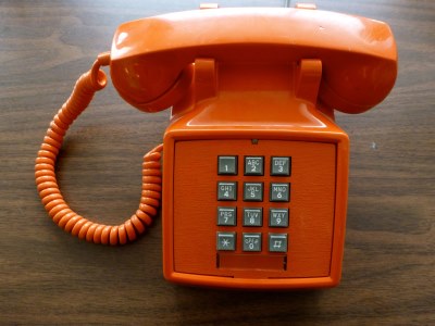 Image: Denise Krebs Image: Denise Krebs |
After rotary dials, phones moved on to using push buttons. Whilst most push button phones contain electronics to enable them emulate LD (Loop Disconnect) technology by generating trains of pulses, almost universally, push button phones use a system called DTMF. DTMF or Dual-Tone Multi-Frequence, are the tones generated when you press keys on a numeric keypad. I'm sure you all recognize them. As their name implies, the tones are created by the mixing of one of four 'low' frequency tones and one of four 'higher' frequency tones. This combination results in a total of 16 possible distinct signals. The frequencies range from 697Hz to 1633Hz, and all the tones are within normal human hearing range. |
The end of the dial
 |
The dial was replaced with buttons with the aim of improving accuracy of dialing, speed of dialing, and ease of dialing (both for ergonomics, and also the ability to dial with less focussed attention requirements). Care was also taken to research if performance improved with practice. |
Test, Test, Test
Using a selection of employees from the Bell Telephone Laboratories, tests were performed on sixteen potential keypad configurations. In addition to capturing raw performance data (dialing speed, accuracy, and how these improved over time), test subjects were also asked for their preferences and any suggestions they might have.
Interestingly, there was no significant relation between initial questionnaire preference and subsequent keying performance, and half the subjects changed their preferences after using the designs. This highlights the importance of prototyping and actual testing; people thought they knew what they wanted, and gave opinions, but at the end of the day it's the hard performance data on which the product success is judged. In this case, there was no correlation between the predicted performance (when the design was exposed), and the actual performance (whe it was actually used).
Data levels all arguments!
The sweet sixteen
Below are the sixteen design patterns selected for the test. As you can see, there is an entire spectrum of designs. Some of the designs mimic the circular layout of a traditional rotor (in various configurations). Some group the buttons in grids, or vertical, or horizontal lines, and some are just a little whacky! Tests were also made using, what we now know, is the final layout, as well as the alternative, but similar 'calculator style' grid layout.
NOTE: The research paper did not give explicit names for all the designs so, for some of the designs, I have made up my own names.
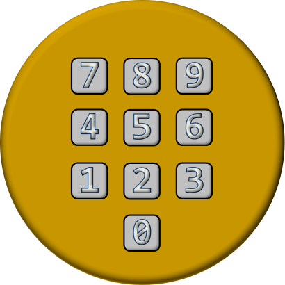 | 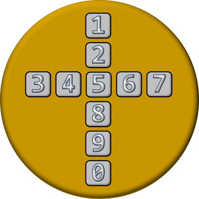 |
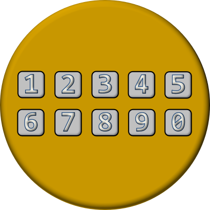
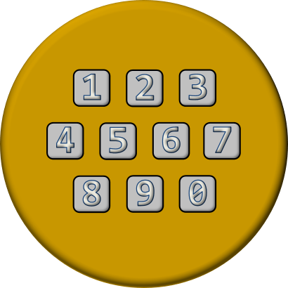
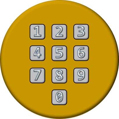
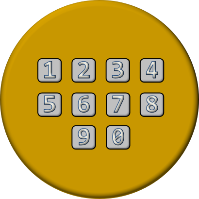
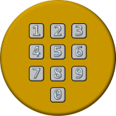
| Three-by-three plus one 'calculator' layout | Cruciform |
 |  |
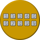
| Speedometer | Two horizontal rows |
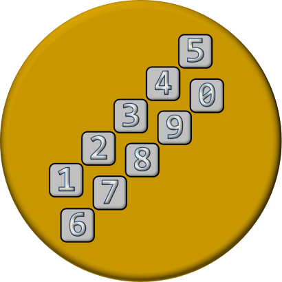 |  |
| Stair-steps | Rainbow |
 |  |
| Beehive | Bowling Pins |
 |  |
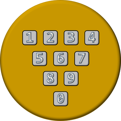
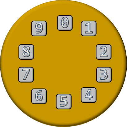
| Reflected Telephone Dial | Three-by-three plus one |
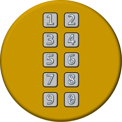 |  |
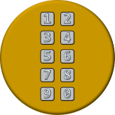
| Two vertical columns | Ring |
 | 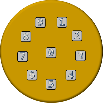 |
| Four-by-two plus two | Bullseye |
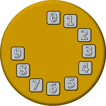 |  |
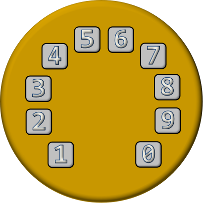
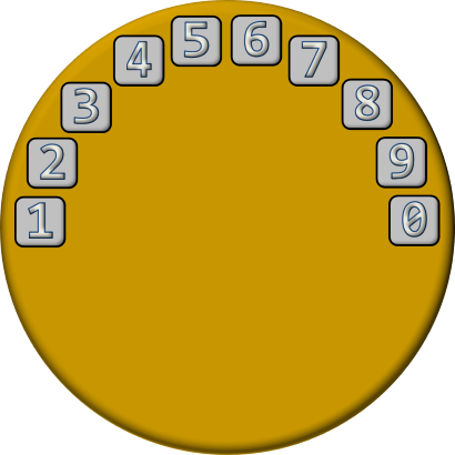
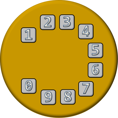
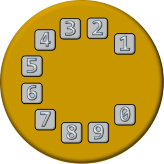
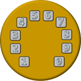
| Clockface | Telephone Dial |
In most of the tests, only small differences were found in the keying times and errors between subjects (repeatable results), and very quickly some designs could be eliminated as they produced significantly slower keying and more error prone results.
The top five performing layouts were used in a second phase of the study. These designs were:
Three-by-three plus one (what we know is the winning design)*
Two horizontal rows
Two vertical columns
Circular traditional telephone dial emulation
Speedometer
 |
 |
 |
 |
 |
*The keypad layout, as we know it, performed slightly better than the calculator configuration, so this was put forward into the next phase of geometry testing.
At this phase, the testing of all these final five designs showed very little variance in performance and, were history to be repeated, a different configuration could easily have been adopted!
Narrowing the selection down
At this point, the two vertical column solution was rejected, not because of performance/accuracy, but because, subjectively, the subjects did like 'like' this design and rated it poorly.
The square layouts possessed engineering/mechanical advantages for construction and so the radial designs were also rejected.
The final choice for the design was made by examining the performance improvements/degradations that occured by changing the size of the buttons tops, and the gaps between the centres of the buttons in the layouts. A winner was found!
And that, ladies and gentlemen, is why telephone keypads are configured the way they are!
Don't you love data driven design?
You can find a complete list of all the articles here. Click here to receive email alerts on new articles.

© 2009-2015 DataGenetics Privacy Policy