

Newsletter: Click here to join an email list and be contacted when a new article is published.
Advertisement |
|
Progress Bars
 |
If you use computers, you’ve experienced progress bars. Progress bars are incredibly useful; they give feedback on the status of non-trivial tasks. In addition to giving a visual feedback of the advancement of the task (through the use of a growing bar), most progress indicators give an estimate of the amount of time remaining. |
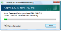
There’s a good chance that you might have seen some of these estimates give pretty ludicrous suggestions of the time remaining.
You’ve also probably watched in frustration as time to completion estimates yo-yo up and down, swinging wildly between extremes. What’s going on? Why do the estimates do this? Why can’t software engineers make them display more sensible and consistent indications?
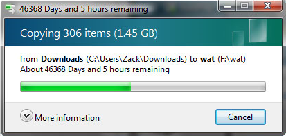 |
How long? I'd better go get another cup of coffee (or two …) |
It turns out, it’s a hard problem.
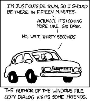 Source: XKCD
Problem
The absolute progress (length of the bar) is easy to compute. It can never go backwards. It’s a percentage indicator. If you have a 10MB file to transfer, and 6MB has already been sent, then the bar would be at 60%. The more bytes sent, the more the bar grows. It’s a simple ratio.

If the file transfer rate (or processing, or whatever the progress bar is measuring) is not happening at a fixed constant rate, any estimate of time to completion is going to be a guess. Let’s look at a couple of examples:
Imagine we have a 10MB file to transfer, and the bandwidth of the connection allows a transfer of 1MB/second. If this bandwidth remained constant at a 1MB/s rate, the total transfer time would be 10 seconds, and the progress bar would grow linearly with time. The time remaining clock would count down, in real time, the estimate of time remaining.

However, imagine what would happen if the transfer rate were not able to keep a constant bandwidth. What would happen if, after two seconds of 1MB/second transfer, the rate dropped to half this rate (0.5MB/second) for the next eight seconds? What would be the expected completion time now? Well, there’s no correct answer; everything is an extrapolation, and the are different approaches we could take.
 |
We could look at the average rate until now: Ten seconds have elapsed since the start of the transfer, and the total number of MB sent was: (2 × 1) + (8 × 0.5) = 6MB, so the average transfer rate over these 10 seconds was 0.6MB/s. As there are 4MB still to transfer, one could argue that another 6.67 seconds is a good estimate of the estimated completion time (4MB at 0.6MB/s). |
This above estimate is based on the assumption that the past avg transfer rate is an accurate measure of what the future rate will be.
|
Another, totally valid, extrapolation is to simply take the current rate and say “Well, the current transfer rate is 0.5MB/s, and absent of any other information, we’ll just assume that this rate is the transfer rate we're going to get for the rest of the file transfer”. If we assume this, as there is 4MB still to go, and the rate is now 0.5MB/s, then the time to finish estimate is 8 seconds. |
Any answer inbetween these two values is also just as valid. (As are answers outside of this. One might argue that, as the rate dropped 50%, then there could be another rate drop coming along soon).
|
After a short time, what if the rate returned back to 1MB/s? The extrapolation based on the average over the entire transfer would base its estimate over all bytes transferred to date. The one looking at just the current rate would ignore any past data and simply estimate based on bytes to go. |
|
What would happens if there were a temporary glitch and transfer rate dropped to essentially zero for a little while? The first system would gradually extend the completion time as the average transfer rate fell with each update. The second system would instantly spike up to a massive period of time. |
In real life you can appreciate that temp glitches can often happen, and it's not always possible to get fixed stable bandwith. For these reason, an estimate based entirely on just the current rate would probably be too sensitive.
Blended estimates
Because of these issues, most progress bar time estimates use a blended or smoothed algorithm; typically based on moving averages. Again, there are many ways a moving average can be applied; there is no right or wrong answer, and each system has its own advantages and disadvantages. Some work better and adapt to higher frequency changes in rate, others cope better when the rate change is small in duration compared to the time of the entire transfer.
 |
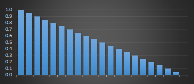
The simplest moving average just takes an arithmetic mean of the last n data points. Rather than relying on the current instantaneous rate, it looks at (say) the last 10 measured rates and calculates the average rate based on these. It’s a First-In-First-Out rolling buffer. High frequency spikes of rate change are smoothed out. The longer the buffer, the less sensitive the estimate is to sharp changes. Because of how the calculations work, moving average estimates phase lag behind sharp changes in rate (the longer the sample period, the longer the lag). |
This phase lag can cause interesting drawbacks where estimate rates are inverted from actual data peaks/troughs where changes are shorter than the sampling window.
An alternate to this simple moving average is a weighted moving average. In a weighted moving average a coefficient is applied to attenuate older samples in the window. The most recently seen estimates are given a high weight, and the progressively older samples are given progressively smaller weightings.
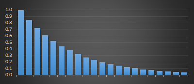
There are two common systems used to scale/attenuate weighting moving averages. These are linear (below left), where the coefficients are applied based on decreasing arithmetic progression (specified as the size of the sample window over which weightings change from 1.0 to 0.0). The weightings look like a triangle.
The second is where the weightings are applied with exponential decay (below right), specified by either a half-life, or a percentage term each subsequent sample is reduced by. As with linear weighted moving averages, the representation of recent samples is treated with more ‘respect’ and validity than older samples in the window. With exponential moving average, each past samples' contribution gets progressively smaller with each step, but it never actually reaches zero.
 |
 |
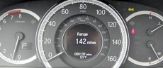
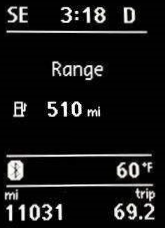
Distance to Empty
It's not just progress bars. Another application where you will encounter a similar extrapolation calculation is on the trip computer in your car. Most modern cars now have a DTE (Distance to Empty) indicator built in.
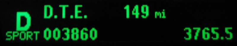
A DTE display extrapolates how many miles you are able to drive before you run out of gas (or your battery goes flat). For input, it has a sensor from the gas tank which measures the volume of gas remaining. As above, it also will use some algorithm to blend the current fuel consumption to estimate how for you can drive.
 |
Basing it on past performance is the correct thing to do. Past performance will give much more accurate results than simply using a fixed factory default. Some people drive with a heavy foot; accelerating hard and braking hard (wasting energy); others drive smoothly and more fuel efficiently. You might be towing a trailer or driving with a roof rack, or transporting gold bullion. We need s system that adapts. |
|
Also, by using a rolling window estimate (over an appropriate time window), the DTE can slowly change when you are stuck in traffic jam or at a long set of lights, rather than jumping up and down. Similarly, if you are coasting down a long hill (using little to no gas), it will not over estimate that you can do a couple of thousand miles using the fuel you still have, nor warn you that you’ll shortly run out when you drive up the steep hill at the other side of valley. It’s a fun exercise to watch the DTE in your car after you fill up the tank for a long freeway road trip (especially if you’ve been pottering around town beforehand). Often you’ll find that your DTE goes up and up and up as you start your trip before reaching an estimated maximum, then gradually starts declining. What’s happening? Well, your trip computer is estimating your fuel consumption based on your current driving (a lot of stop and go driving at low speeds typically gives poor MPG figures). Then, as you get into your freeway cruise your average fuel consumption improves; even though you’re burning gas and using fuel, your measured (blended) consumption rate drops, and so the estimated range increases. |
 |
 |
It’s not really a paradox, but on more than one occasion, I’ve filled up the car and driven to my in-laws and arrived there (after an hour and a half drive), with more range indicated possible than when I set off! |
Nothing lasts forever, eventually the average fuel consumption rate estimate plateaus, and when it stops increasing, the constant burning of the fuel decreses the DTE as you continue driving.
Other uses of moving averages
The stock market loves to use moving averages.
With stock prices you can also apply an additional dimension, and that is the trade volume.
 |
When displaying the average sales price for stocks there are, potentially, hundreds of trades a second; in addition to the time weighting, each transaction can be weighted by the number of shares sold. A couple of shares sold for an outlier value should have less effect on the average sales price than a massive sale at another different dollar value. |
Even more complex
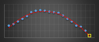
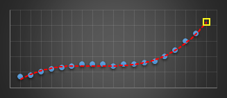
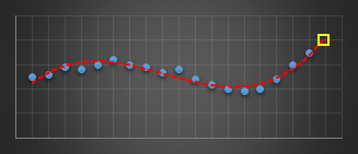
In a past life, I wrote code to predict server issues in an online service. To do this, I used a moving window and fitted a best-fit cubic (least squares) to the last n data points of various metrics. I used this cubic to predict what I expected the next value of this parameter to be. If it was outside a certain threshold I’d report an warning. Using a cubic (order three polynomial) allowed for the modelling of inflection points. The algorithm was pretty robust in not giving false alarms, and was adaptive in nature to metrics that were speeding up, slowing down, or smoothly going through maxima or minima as they varied under load.
 |
 |
 |
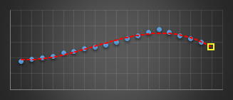 |
The yellow reticle shows the predicted projection for what I think the next sample should have been. When this sample appeared, if it was radically different to what predicted, then an alert was thrown.
I experimented with different orders of polynomials before staying with cubics. Best fit straight lines (order-1) were hopeless at this, as the could not fit the curves. Quadratics (order-2) did OK for certain classes of gentle curves, but suffered badly if the curve inflected (where the second differential went to zero, and the curve changed from convex to concave or vice versa). Cubics (order-3) solved this problem and allowed modeling of the shape. Higher order curves sometimes worked better, but they tended to also attempt to fit the noise as well as the signal and though they fit the data better of the past sampled points, this happened at the expense of more wildly predicting the next sample to come. Cubics seemed to work best.
You can find a complete list of all the articles here. Click here to receive email alerts on new articles.
© 2009-2017 DataGenetics Privacy Policy