
Discrete Cosine Transformations
|
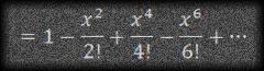
The topic of this post is the Discrete Cosine Transformation, abbreviated pretty universally as DCT. DCTs are used to convert data into the summation of a series of cosine waves oscillating at different frequencies (more on this later). They are widely used in image and audio compression. They are very similar to Fourier Transforms, but DCT involves the use of just Cosine functions and real coefficients, whereas Fourier Transformations make use of both Sines and Cosines and require the use of complex numbers. DCTs are simpler to calculate. Both Fourier and DCT convert data from a spatial-domain into a frequency-domain and their respective inverse functions convert things back the other way. |
 |
 |
Why are DCTs so useful? As mentioned above they are used extensively in image and audio compression. To compress analog signals, often we discard information (called lossy compression), to enable efficient compaction. We have to be carefaul about what information in a signal we should discard (or smooth out) when removing bits to compress a signal. DCT helps with this process. |
Thankfully, our eyes, ears and brain are analog devices and we are less sensitive to distortion around edges, and we are less likely to notice subtle differences fine textures. Also, for many audio signals and graphical images the amplitudes and pixels are often similar to their near neighbors. These factors provide a solution; if we are careful at removing the higher-frequency elements of an analog signal (things that change between short ‘distances’ in the data) there is a good chance that, if we don’t take this too far, our brains might not perceive a difference.
JPEG
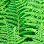
The JPEG (Joint Photographic Experts Group) format uses DCT to compress images (we’ll describe how later). Below is a test image of some fern leaves. In raw format this image is 67,854 bytes in size. To the right of it are a series of images made with increasing levels of compression. At each stage, the image storage size gets smaller, but frequency information in the image is lost as increasingly higher compression is applied. With a small amount of compression, it’s practically impossible for the brain to notice the difference. As we move further to the right, defects become more obvious.
 |
 |
 |
 |
 |
 |
| File Size: 67,854 bytes | File Size: 7,078 bytes | File Size: 5,072 bytes | File Size: 3,518 bytes | File Size: 2,048 bytes | File Size: 971 bytes |
How is this compression achieved? By using a DCT transform, the image is shifted into the frequency domain. Then, depending on how much compression is required, the higher frequency coefficients of the signal are masked off and removed (the digital equivalent of applying a low-pass analog filter). When the image is recreated using the truncated coefficients, the higher frequency components are not present.
Notice the ‘blocky’ appearance of the image on the far right? This is an artifact of how the DCT compression is calculated. Again, we'll look at this later.
Example: One Dimension
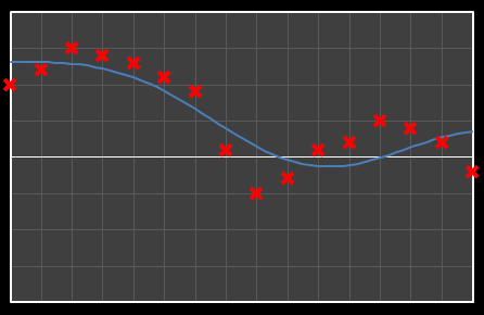
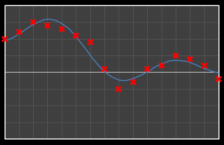
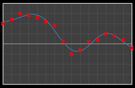
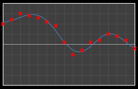
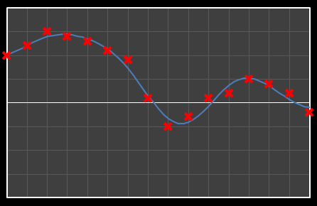
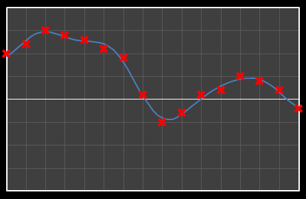
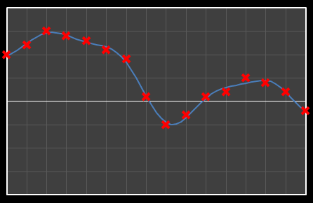
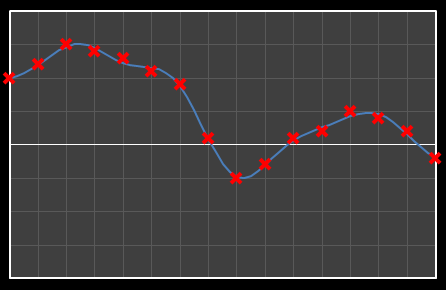
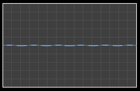
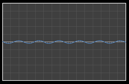
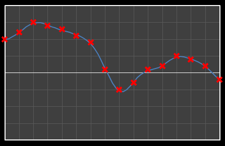
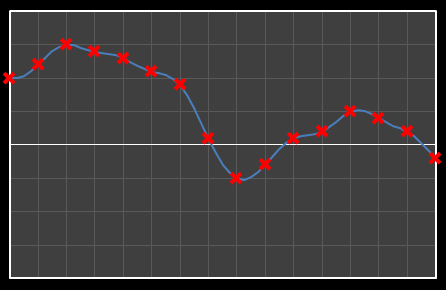
Let’s start with analysis in one dimension. Imagine we have 16 points as shown below. Time is nominally on the x-axis, with a variety of values on the y-axis. We’re going to apply DCT to these data and see the effects how these individual cosine components add together to approximate the source.
The math required to permform DCT is not very complicated, but it's also not rated PG-13. I'm opening with the concepts, then I'm going to brush straight past the implementation steps and move onto the results. For those that like to code, and want to experiment with this, let me give the standard advice: “"Google is your friend!"” – you can find plenty of implementations of DCT in the language of your choice on the web.
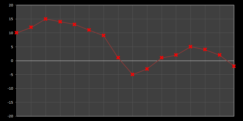
Using DCT, we can break this curve into a series of Cosine waves of various frequencies. It is by the superposition (adding together) of these fundamental waves that we recreate the original waveform.
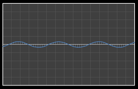
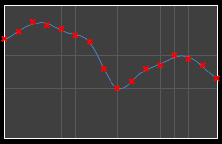
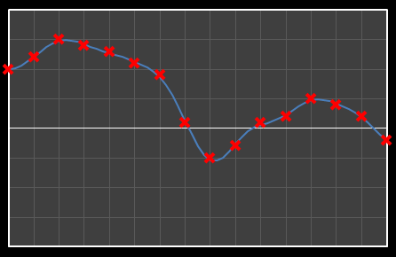
For the above sixteen points, I’ve broken down the data using DCT. The graphs on the left below show the cosine function of that frequency component and the image on the right shows the superposition of this to the running total (this component added to all those above it). The lowest frequency components are shown first, and as we move down the page, the higher frequency components are added. Above each graph is a number showing the coefficient ‘weight’ of each frequency component. Typically (though not always), these numbers get smaller as the contribution to the overall shape from these higher frequencies gets smaller.
As we move down the charts we can see that shape getting closer and closer in approximation to the original data (the errors between the actual data and the curve approximation getting smaller – the differences being the higher frequency ‘wiggles’ in the raw data). Depending on the level of compression we needed we could truncate the higher frequency components as needed and decided where to draw the line at a ‘good-enough’ approximation.
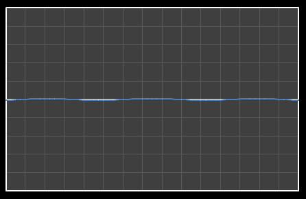
| Χ0 = 7.867 | [0] |
 |  |
| Χ1 = 6.742 | [0–1] |
 | 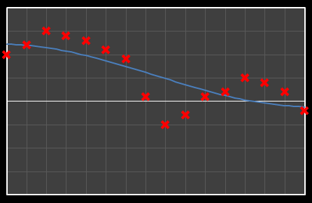 |
| Χ2 = 2.886 | [0–2] |
 | 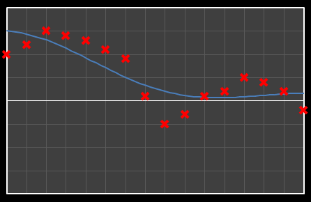 |
| Χ3 = -2.001 | [0–3] |
 |  |
| Χ4 = -3.991 | [0–4] |
 |  |
| Χ5 = 1.546 | [0–5] |
 |  |
| Χ6 = -0.084 | [0–6] |
 |  |
| Χ7 = -0.703 | [0–7] |
 |  |
| Χ8 = -1.149 | [0–8] |
 |  |
| Χ9 = 0.526 | [0–9] |
 |  |
| Χ10 = 0.439 | [0–10] |
 |  |
| Χ11 = -0.202 | [0–11] |
 |  |
| Χ12 = -0.165 | [0–12] |
 |  |
| Χ13 = 0.382 | [0–13] |
 |  |
| Χ14 = -.026 | [0–14] |
 |  |
| Χ15 = 0.368 | [0–15] |
 |  |
Example: Two Dimensions (and the basics of JPEG compression)
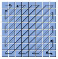
We can apply just the same technique in two dimensions, this time breaking the image into blocks of pixels and looking at the harmonics in each block. The result of this analysis is a matrix of coefficients. Moving down and to the right are the coefficients with increasingly higher frequency components. As before, we can compress an image by masking off and truncating the coefficients at frequencies higher than we care about.
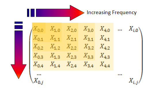
In JPEG compression, the block size used is 8 x 8, resulting in a similar size matrix of coefficients. However, for my examples, I’m going to select a larger block size of 16 x 16 (I think it is easier to visualize things at this size.)
|
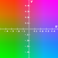
As you probably know, colors in computer images are often describe by the relative mixing of their Red , Green and Blue components. This is, internally, how computers store the image data, but this is not the only way to describe colors. Another method is called YUV. It’s outside the scope of this article (follow the link for more background), but this format describes colors by their luminance and chrominance (Sort of like the brightness of the color and the shade of color). Our eyes are more sensitive to changes in brightness than changes in shade, and this can be exploited for more compression by converting RGB colors in YUV space, then UV channels can be sub-sampled (quantized) and reduced in dynamic range – Because of lower senstitivity you need fewer distinct levels of shade of a color than the brightness of a color to still maintain a smooth image. |
 |
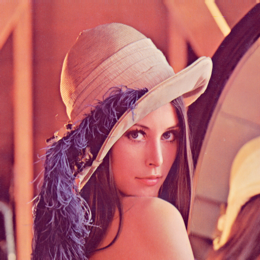 |
Because we are working on image processing, we have to roll out Lenna, the “The First Lady of the Internet”. This image is probably the most widely used test image in computer history (click on the link for background details). 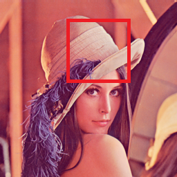
|
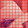
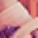
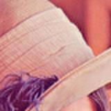
We're going to look at a selection of 16 x 16 pixel blocks around the hat. Below are sixteen version of this region rendered using coefficients truncated at various levels. Initially the individual blocks are clearly visible. As the coefficients are truncated higher, the edges of the blocks become less discernable but the images still look a little blurry. As the coefficient cut-off increases, the images get sharper.
| 0 | 1 | 2 | 3 |
 |  |  |  |
| 4 | 5 | 6 | 7 |
 |  |  |  |
| 8 | 9 | 10 | 11 |
 |  |  |  |
| 12 | 13 | 14 | 15 |
 |  |  |  |
JPEG Advanced
The above paragraphs explain the concept of how JPEG compression works (reduction of the higher frequency components), in reality, it is a little more complicated.
The DCT is applied over an 8 x 8 block, to produce an 8 x 8 matrix of frequency coefficients. Each block is calculated distinctly, and the color of the top-left pixel of each block determines a fixed reference and the other pixels in the same block are described relative to this pixel (this helps reduce the dynamic range needed for the DCT function, and typically benefits the quality of the image as often there is not a massive variation in colors between pixels in the same block).
Rather than simply truncating and masking off the higher frequency components of the DCT matrix as we did above, however, in JPEG the frequency coefficients are scaled (individually) by a quantization matrix. This matrix scales (divides) each coefficient by a numeric term. The quantization matrix is pre-calculated and defined by the JPEG standard and naturally favors the items in the top left corner of the matrix (the more frequency significant terms) than the lower right. Each coefficient has a different weighting.
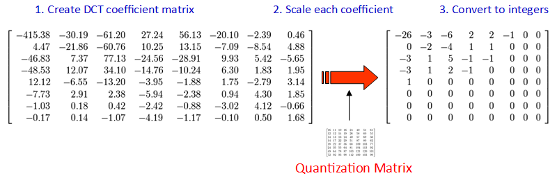
The results of this division are then converted to integers (from floating point), causing further quantization. A typical output matrix of this process is show above on the right. Notice this, as we expect, biases the top left corner where we know the most ‘important’ coefficients reside.
 |
The final step in the JPEG compression is called ‘entropy encoding’ and this is the mechanism for how the coefficients of the final matrix are encapsulated. The technique used is a run-length encoding algorithm which losslessly compresses the matrix because there is often redundancy of multiple occurrences of repeated values. This works especially well because, rather than simply reading the values in a traditional, grid format, the input stream to the compression zig-zags through the matrix starting at the top left corner, and ending in the lower right. As you can appreciate, this increases the chances that adjacent values will be of similar value (and often, as you can see in our example, it’s typical for there to be many zeros at the end of the string which compact very well indeed!) |
Finally, let’s end with a little bit of fun …
It is possible to merge two images with different spatial frequencies.
When this hybrid image is viewed from a close distance, the higher-frequency elements stand out, revealing these components of the image in high contrast. When the hybrid image is viewed from a far distance, these higher frequency subtleties are not discernible and the eye/brain smoothes and interpolates the lower frequency components.
 |
To make a hybrid image containing two images we use the digital equivalent of a high-pass and low-pass filter. In the example below, I’ve taken the Lena image and passed it through DCT to convert it to the frequency domain. (To make this a little clearer, for this example, I’ve also converted the image to gray scale and also used a larger block size). Then I removed the high frequency coefficients from the matrix (a low pass filter). |
|
Next I took another image (this time a self-portrait), converted this to gray scale, passed it through DCT, but this time only preserved the higher frequency coefficients of the frequency matrix (a high pass filter). |
 |
These two sparse matrices were then combined and passed into the inverse DCT function. Here is the hybrid result:

If you look at the hybrid image whilst sitting directly infront of your monitor/tablet you should clearly see the ghostly outline of my face and shirt (lucky you!). Now get up and walk to the other side of the room and look at the image again. This time you should see the Lena image, and only the Lena image – my face has gone. Spooky!
| Can't see it? Click here to show the image slowly reduced for you. |
You can also experience the same effect by squinting at the hybrid image. Squinting artificially reduces the size of your pupil creating a Pinhole effect, increasing the depth of field for your eyes. |
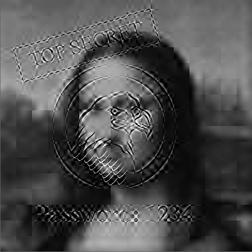
Hidden Letters
|
This hybridization is not just academic. Have you ever been paranoid that someone is looking over your shoulder as you use the ATM?, or watching you from the opposite side of the aisle you type something sensitive on your laptop during a flight? Imagine if these devices used a hybrid image technology! They could display a hybrid image created from a superposition of different sources. Not only would the evesdropper not see what you are seeing, but you could make the “fake” image (the low-frequency domain image) display bogus information. Only someone viewing from the appropriate spatial-distance would see the correct image (with care, more than two images could be combined by selecting the appropriate band-pass filters and combining the resultant matrices). |
 |
To show an example of this look at this hybrid image below of the Mona Lisa. Viewed close up you should be able to make out the password. Now look at the screen from a few feet away. See it now?

|
Need more convincing? The image below is the same image as the one to the left. All I've done, if you View Source for the page, is overide the width of the image from the default of 512 pixels to 128 pixels. Your browser has scaled down the image using an appropiate algorithm, and has averaged out the pixels, reducing the higher frequency components. This is similar to what happens when you stand further away from the screen.
|
Can’t see it? Here’s a version where the “Hidden Text” is even higher contrast.
If you squint at this one, you should still be able to make the hidden text go away.
You can find a complete list of all the articles here. Click here to receive email alerts on new articles.
© 2009-2013 DataGenetics