
I’d like to teach the World to Sing …
 |
If the World united tomorrow, and we wanted to give ourselves a flag, what would that flag look like?
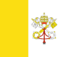
If we wanted it to reflect all the constituent countries, how would it look? There are currently around two hundred countries in the World. It’s almost impossible to give a politically correct answer for the exact number of countries. The United Nations recognizes a certain number, but then there are independent countries (such as Vatican City) that are not United Nations members, but still officially countries. Then there are wars, disputes, and arguments. Different country Departments' of State recognize different entities around what may, or may not be, considered countries from their perspective. There’s also the concept of Territories and Colonies that are governed by other countries but are not independent in their own right. (Such as Puerto Rico). I’ll stop short of saying it’s a mess, but it sure is complicated. |
With these facts in mind, this is designed to be a light-hearted article about flags, not some political comment. This article is not my opinion about how things should be, nor my perspective about ground truth. I simply downloaded some flags from the internet, used Wikipedia to get some country statistics, and combined them!
Flags
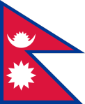 |
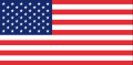
With the exception of the flag of Nepal, which is two triangular pennants, all other national flags are rectangular. There are a couple of square flags (Switzerland and Vatican City), and the rest are non-square rectangles of various aspect ratios. The flag of Qatar has the most extreme ratio with 11:28 proportions. The flag of France has the ratio 2:3, whilst the the USA has ratio 10:19.
|
| Switzerland | Vatican City | Qatar | France | USA |
 |
 |
 |
 |
 |
As I will be merging flags in this article, I elected to normalize all flags to be the same aspect ratio. This resulted in some distortion/stretching for some flags. All flags got converted into 2:3 aspect ratio.
Simple merging
My first attempt at a World flag was to merge all the flags into one, and simply average the colors. This is the result:
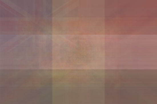
There are obvious patterns where the flags that contain horizontal and vertical stripes overlap (with the lighter colored stripe being the middle stripes). Also visible that in the top left corner is the Union Flag traditionally associate with the UK. In this case it is present because multiple donor countries have this element common in their national flag. For instance Australia and New Zealand.
Population
I’m not going to say that any one person is more important than any other person, but by simply merging the flags (as above), each country gets equal shading in the average. One alternative is the weight the flags by the population of each country. Below is this result:
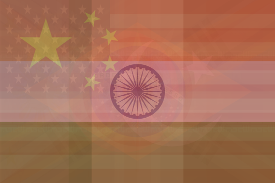
Elements of the flags of China, India and the USA are clearly visible based on their large populations and distinct flag features. Stripes of the other co-mingled high population countries are visible. This is a flag of the people.
Area
Another interpretation is that a country is defined by its land, not its population. Here is the result of merging the flags with colors proportion to their land areas:
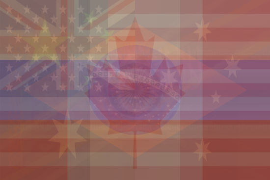
The elements of Canada, Russia, Australia and Brazil clearly shine through.
Whilst it has a large land area, Antarctica is not a country, so does not have a national flag (though some designs have been proposed). It also does not have a capital city!
Vexillology
As fans of The Big Bang Theory will know, the study of flags is called Vexillology
You can find a complete list of all the articles here. Click here to receive email alerts on new articles.
© 2009-2014 DataGenetics Privacy Policy