Digital Cameras
This article talks about digital cameras, and their sensors.

Digital photography overtook print film photography at the beginning of this century and has not looked back. Today, print film cameras are practically museum pieces. Interestingly, sales of digital cameras have similarly plummeted to noise in recent years because of the prolific rise of the smart phone. Digital camera sales, these days, are in the narrow high-end markets of professional and semi-professional users (referred to as “pro-sumer” users).
There are now billions of smartphones in the World, each of which has one or more cameras built in. Each new iteration of a smartphone typically improves the optics and sensor size. Marketers love to boast about the number of “megapixels” their cameras have.
In addition to the added speed, convenience, quality, and resolution of digital photography over analog photography, digital cameras can also capture movies, not just still images, so pretty much every digital still camera can turn into a camcorder.
Not surprisingly, sales of traditional camcorders have also dropped to nothing. These too have been added to the (ever increasing) pile of yesterday’s technology (along with VCRs, laser disks, rotary phones, dot-matrix printers, mini-disks, cassette tapes, glass CRTs, analog TV broadcasts, floppy disks, CDs …)
Megapixel
Just what is a megapixel, and why does having more of them (theoretically) make for a better photograph? Also how does a digital camera work?
A megapixel is, strictly speaking, the term used to describe 1,048,576 pixels (220), but colloquially it is used to represent a ‘traditional’ million pixels (106).
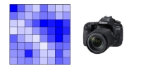
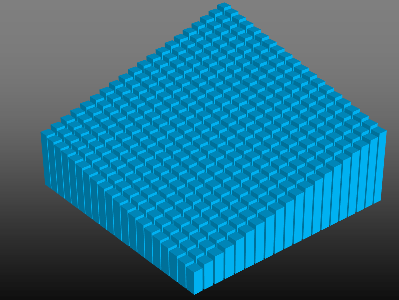
The megapixel value of a camera is in reference to the number of individual components in the light sensor of the camera. It is a measure of the number of “picture elements” (aka pixels) that are encoded to represent a picture. A sensor with 3,000×2,400 individual sensor elements has a fundamental resolution of 3,000×2,400 = 7,200,000 pixels so is referred to as a 7.2 Mega pixel camera.
A pixel is the most atomic individually addressable element of the sensor, and the value it records is a measure of the light falling on it. It dictates the fundamental maximum resolution of the picture that is taken. No matter how much you “zoom in” or “enhance” a picture, you can’t increase the resolution better than the number of pixels in an image, hence the more pixels in the sensor, the better the theoretical resolution of the finished image.

Other factors come in to play to make a high quality photograph. For instance, the quality, pureness, and size of the lens used to focus the light onto the sensor makes a massive difference to characteristics of the final photograph (which is why professionals will spend tens of thousands of dollars on lenses!), as does the physical size of the sensor (a larger sensor can capture more light and be less susceptible to electronic noise).
A digital camera sensor works a little like our own eyes. Using a lens, light is focused onto an array of sensors. In a human eye, these sensors are rods and cones on the back of the retina. In a digital camera, they are sensors on the cells of the grid.

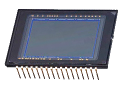
A digital camera sensor is a solid-state sensor. There are a couple of common technologies used: CCD (charge coupled device), and CMOS (complementary metal oxide semiconductor) but both measure the light falling on them; they are topless integrated circuits. They are grids of millions of solid state cells, which record the amount of light falling on them as the light adjusts the electronic properties of the semi-conductor in each cell.
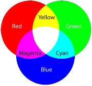
In the last article, about how color TV works we recalled how a color image can be can be made by combining the correct mixtures of red, green, and blue light in appropriate quantities. You might, therefore, think that a 7.2 Mega pixel camera captures a matrix of 3,000×2,400 lots of measurements of the red, green, and blue values. This would seem logical, but that is not what happens. In fact each individual pixel in digital camera is actually colorblind! Huh? So, how does it capture a color picture?
That's right, the image taken by a 7.2 Mega pixel camera is not created from 7.2 million values for red, green, and blue. The actual raw image is actually a third of this size! Only one value (amount of light) is stored for each pixel.
Bayer Array
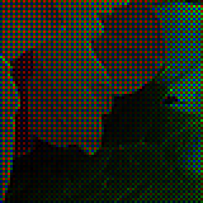
The magic happens because each pixel has an individual color filter placed above it. Like a pair of tinted sunglasses it acts like a filter, only letting through the wavelength of light it wants to measure. There are millions of red filters, green filters, and blue filters.
The sensor under the red filter only records the level of light that passes through its filter (red light). The sensor under the green filter …
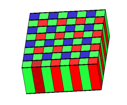
What is more interesting, is that these filters are not distributed equally.
The human eye is significantly more sensitive to green light than red or blue (over half of the 6 million cones in a human eye are sensitive to green light). To mirror this sensitivity, half of the sensors for a digital camera are also configured with green filters above them. The digital camera mimics the eye by capturing the image in higher resolution for the wavelengths our eyes are more sensitive to.
These green filters are arranged in a checker-board arrangement, alternating in parity between odd an even rows.
Red and Blue sensitive pixels fill in the gaps between the Green in alternating rows.
This arrangement is named after its inventor Bryce Bayer. This was such a great breakthrough idea that a quote about him is "the maestro without whom photography as we know wouldn't have been the same". Whilst other arrangements have been tried, the simplicity of the Bayer pattern GRGB has stood the test of time (U.S. patent number 3,971,065).
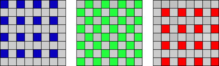
As you can see from the Bayer masks above, Blue is only measured at 25% of the pixels. Red similarly for 25%, with 50% for Green.
To create a full color picture we need to determine the Red, Green, and Blue values for every pixel. We need to fill in the gaps.
Mind the Gap
How should we fill in the missing pixels? The term used to fill in the missing pixel information is demosaicing (de-mosaicing). We'll come back to this shortly, but first a glimpse about what a camera actually records.
Here is an image of some hydrangea flowers:
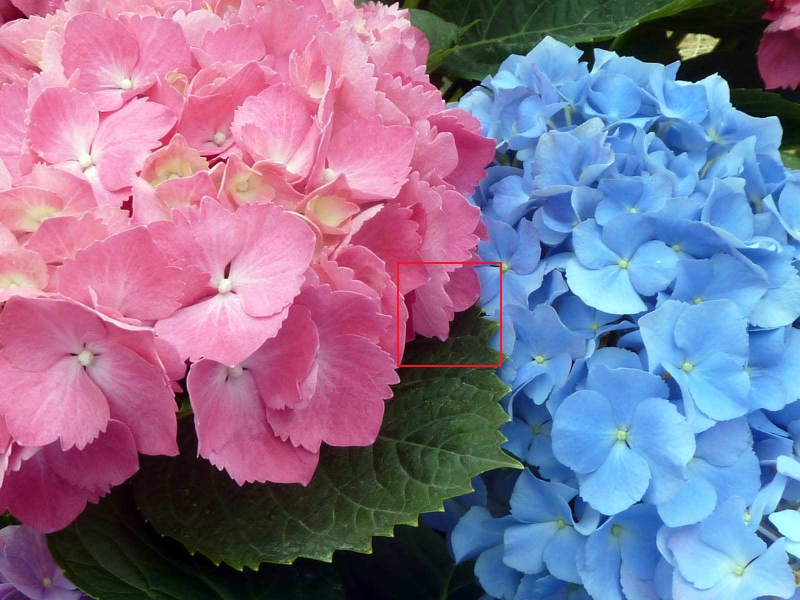 Image: Nacho
We will focus on this small section of pixels between the two flowers.

On this image we'll apply the bayer filter (shown right), sample, and examine the results.(I'll blow them up so you can see the results).

Here are the individual color outputs:
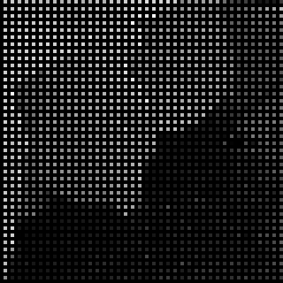

This is just the intensity of the red pixels. As you can see, only 25% of the pixels have recorded values. The values are high on the left and upper sections of the image, as expected, because of the pink color of the hydrangea on this side of the sample.

This is the map of the data recorded for the green pixels. The sampling is more dense here, with 50% of pixels being sampled.
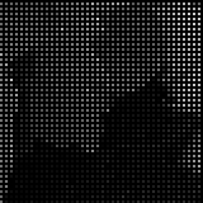

These are the values of the pixels behind the blue pass filter. As with red, data is only captured for 25% of the image.
RAW
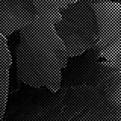
Combining all these images (each pixel only captures one color, and there is no overlap) shows what the camera sensor actually records. This is called the RAW format. It is show as the image on the left below:

This, of course, looks nothing like the original image. To generate a full color image, the bayer pattern (shown right) has to be applied and then the missing values approximated from the information that is present (de-mosaicing).
De-mosaicing
If we only use the information captured by the camera array we get something horrendous like the depiction on the left. Here, each pixel is just the showing the intensity of the color channel it represents from the data it individually captured.
To get a better quality image we need to approximate (guess), what the missing Red, Green, and Blue intensities are at the locations where they were not sampled. We'll then have RGB values for every pixel, and able to generate a full for each pixel.
There are many different ways we could do this approximation. Let's investigate some of them.
Nearest-neighbor
One (simple) strategy is to just fill in the missing pixel with the (known) value of the same color adjacent to it. This strategy is called the nearest-neighbor sampling.
Nearest-neighbor is quick, easy to understand, and does not involve the creation of any new values. We measured the value of light at certain pixels, and so we know these to be true. Absent of any additional information it's a not a unreasonable guess to say that the pixel we don't know about could be the same color as ones we do that are next to them. (As, in this case, the unknowns are in the middle and equidistant from the knowns, we can make the definition that we echo the pixel upwards and to the left of each known pixel).
Here is an example of how this might look. Below, on the left, are a series of samples showing measured blue pixels. On the right is what we'd get using the nearest-neighbor algorithm to fill in the gaps.
This process can be replicated for the other two colors, then, now that RGB values for every pixel have been obtained, the desired full color for each pixel can be determined.
This algorithm might seem a little agricultural in design, but is very simple, fast, and has the advantage that no intermediate color is 'made up'. The only value that a pixel can be is the that of an adjacent pixel, and this has been measured sum-certain, so we are not creating colors/shades that might not have existed in the original. As we will see below, there are more sophisticated demosaicing algorithms, and these interpolate and predict what the missing values are. These intermediate interpolated values might not be the same as the pixels on either side (or in fact, the same as any other pixel color in the image). When dealing with analog photographs, and high resolution images, this is usually not an issue, but if we are dealing with digital images where pixels are quantized to set values (having a fixed palette), this can cause issues.

The techniques described here for filling in the missing pixels are also used, more generically, in the algorithm to stretch and shrink images in your typical paint package. See also this article about scaling up graphics in classic video games.
Interpolation
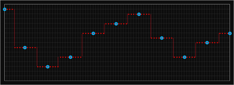
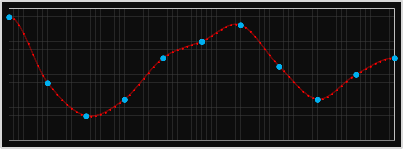
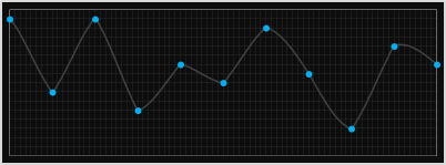
In a Bayer filter, there is only one intermediate gap that needs to be filled in but we can extend this algorithm to a more generic problem in filling in missing data. This is called interpolation. For nearest-neighbor interpolation, the approach is exactly the same; the value we select for each pixel is that of that of the nearest known value. This results in repetition of the value multiple times, as needed by the granularity of the interpolation.
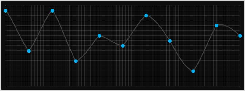
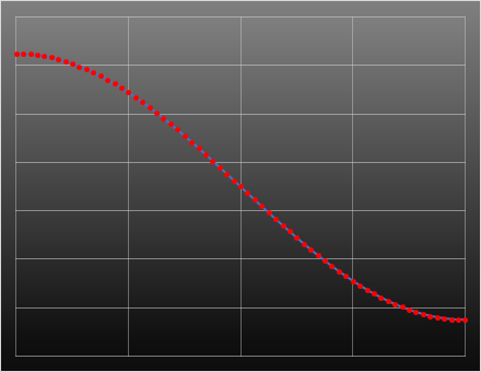
Below is an example of how this looks in 1D. In the chart below, the larger blue dots are those of the known samples, and the smaller red dots are those that have been interpolated with the nearest neighbor approach. It looks very blocky, and there are sharp edges.
Here is some sample data in 2D showing how things look interpolating four data points in 2D using nearest-neighbor. (Imagine you had an image and wanted to stretch it to 10x original size. One possible approach would be to duplicate every pixel 10x in each direction to make 100 copies of each pixel).
Linear Interpolation
Intuition suggests we might be able to better? Nearest neighbor might work well with large blocks of uniform color, but if there is a gradient in the color, then the nearest neighbor algorithm will create steep stair-steps. How about, instead of of taking one of the known values, we average out the values either side?
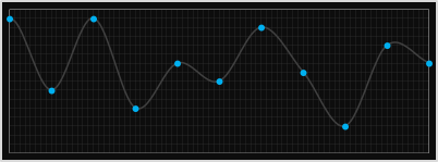
Looking at this more generically, this kind of interpolation is called linear interpolation. Imagine drawing a straight line between the two end data points, and then, at the resolution needed, samples can be calculated using their position on this line. We're not getting any 'additional' information that was not present in the original image, we're just smoothing out the samples in between. This might look more natural to the human eye where the colors gradually change, but at the expense of a fuzzy edge where there is a sharp change in the real data.
Here's an example of linear interpolation in 1D using the same example data set from the nearest neighbor example. As you can see, between each data point, the values change in a linear fashion. It's a linear blending pro-rata between the data at each end.
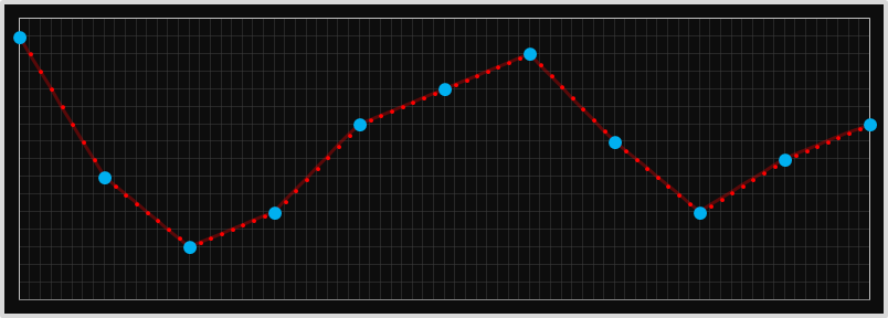
The kind of linear interpolation is 'better' at estimating the interior points, but still produces very sharp corner points. The plot above looks like shark teeth.
If this blending is performed in two dimensions (as it would be on a picture), you get a something like this (each interpolated value is pro-rata linearly proportional to the data values at the corners):
This is what it looks like when applied to the example bayer pattern we used earlier. This kind of interpolation is called bilinear interpolation. The resultant image looks less 'blocky' (compared to the nearest neighbor approach); most of the time this is a good thing, but has the disadvantage that it might blur out sharp edges that are supposed to exist in the real image.
Quadratic
If linear interpolation produces a 'smoother' interpolation how about applying a higher power polynomial approximation? Rather than just using the two data points at each end, how about using more data points to help predict the curve/change in the data?
The next obvious suggestion is to apply a quadratic (second order) polynomial. For this, we require three data points.
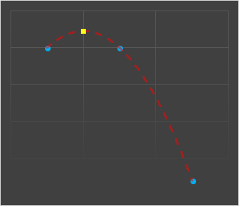
Ignoring the asymmetry of having to select either the additional point to the right or left (we similarly glossed over this with nearest neighbor), quadratics are poor choices for a couple of reasons.
The first is that they have no inflection points (change to concavity), which is often needed to smoothly model. The second is that they tend to massively under- or over-shoot in their need to fit the curve through the third datum.
This second issue means that the intermediate point can often be way different from the the two sentinel values (creating weird artifacts), but more seriously can cause clipping issues. If the two data points to be interpolated between were, for instance, at peak level, the interpolated point could easily exceed this value (and the inverse for a curve in the opposite direction).
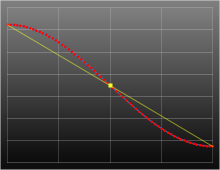
In the diagram on the left we're attempting to quadratically interpolate a value mid-way between the two left data points using their values, and the next data point along.
You can see that the value predicted (shown as the yellow square above) is very different from the known samples either side that it's supposed to be interpolating between.
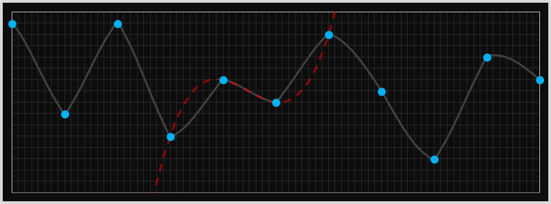
Cubic
Cubic curves (third order), have the potential to give better approximations. They are able to generate inflection points, and use more data points to help fit a better curve.
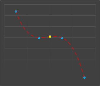
To generate a cubic curve, we need data from four points, and this also gives symmetry. In addition to the two data points which we are trying to sample an intermediate value between, we can use the further out points on either side to learn more about the 'shape' of the curve to help determine the trend.
We can use a rolling window, and generate the missing intermediate value between two points by generating the cubic that passes through each pair of points and the two outliers. Each pair of points will have a different cubic (this is not like fitting a least squares best fit polynomial through all the points).
This technique can be applied to interpolate, parametrically, any intermediate value between these data points, and here is a graph showing this interpolating some 1D samples.
At first glance, these stitched curves appear farily smooth, and certainly better than nearest neighbor, linear, or quadratic, but they are not perfect, and there are still some 'unnatural' transitions.
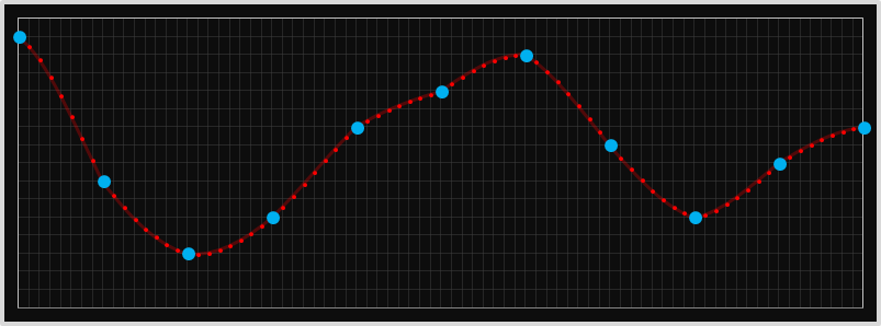
We can see these issues if we look at a more severe set of points. Here is the graph of stitched full-cubic curves for a different set of data. Look at the points below, even though we're fitting cubic curves through each set of four points, the resulting curve looks quiet pointed. What's going on?
The explanation should become obvious when we draw in the complete cubic for one of the segments. In the diagram below we can see the extension of the cubic for one of the middle segements. Even though we are only rendering the section between the two middle points, the curve, in its need to pass through the two outer points gets more severe. It doesn't really match the segements either side (which were generated from an entirely different cubic). We can do better.
Catmull-Rom Splines
We're going to stick with generating cubic curves (for which we need four data points to define). We're going to keep the restriction that the curve passes through the two inner data points (for obvious reasons), but rather than requiring it to also pass through the two outlier points, we'll specify the gradient of the curve at the two inner points.
With the values of the two inner points, and the gradients at the these points, we'll have four variables and thus sufficient unknowns to calculate the three parameters necessary to specificy the cubic.
We'll use the two outlier points to help specify the gradient needed (details below).
Let's break out some (simple) calculus (after all, it would not be a true DataGenetics blog posting without a little calculus!)
The generic equation for a cubic curve is as follows:

If we can determine the values for the coefficients: a,b,c,d we can describe the curve.
Differentiating the equation gives this result:

Here is a normalized picture of a cubic with four equidistant points. We're trying to interpolate the points between y0 and y1.
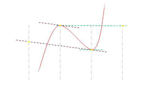
From the equations above, we know the following about the function of the red curve:

Inserting values for x=0 and x=1 into this formula generate these equations:
Rearranging shows how we need to derive the four values needed
We already know f(0) and f(1), so we need to select values for f'(0) and f'(1).
For the gradient at y=0, we'll derive it from the gradient between two points y=1 and y=-1 (making it parallel to the line passing through these data points. Similarly for the gradient at y=1. This is the secret sauce to Catmull-Rom. These gradients are shown in the graph diagram above as the dashed purple and green lines.
This gives the following equations:
Plugging all these in together gives us all we need to derive the coefficients a,b,c,d necessary to describe the cubic.
Awesome! We have everything we need to describe this cubic polynomial.
This polynomial is given the name of a Catmull-Rom spline. Because of it's properties about how it smoothly transitions between abutting segments it's very popular in computer graphics.
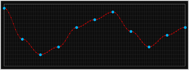
Here is a rendering of it interpolating our first 1D sample data set:
Here it is interpolating the more extreme data that cause issues with the full cubic spline.

For comparisons here are the two curves side by side. I think you'll agree the Catmull-Rom has a more 'natural' appearance.
When applied over two dimensions, this is called Bicubic Interpolation. Here it is applied to the fictitious bayer sample data.
Interpolating, parametrically, inside between four points you can see how the data curves smoothly in both dimensions. Here is the function applied to four data points in the corners to show the smooth curves in each direction for the intermediate points. (To generate this image, I had to create shadow points outside the grid to represent the data points used to set the gradients at the edge. Adjusting these values will adjust the shape of the curved surface and all the intermediate points, even though the corners will not move).
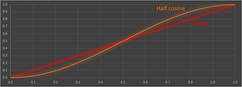
Half-Cosine
Catmull-Rom certainly smooths better than full cubic and quadratic, but still has the ability to under- and over-shoot the values it is interpolating between in extreme cases (something that linear interpolation and nearest neighbor will never do).
There are a couple of other interpolation techniques that put smooth curves between data points without overshooting. One of these is the half-cosine technique.
If you imagine a cosine function you will see that, if you take a half wavelength section, you will have a smooth curve between the peaks of the amplitude.
Scaling and stretching a half-wavelength cosine wave between two points gives a smooth curve with an inflection point in the middle.
The gradient at each edge point is zero (horizontal), so each segment will mesh with no sharp corner or change in gradient. Also, since the curve is monotonic, the gradient is flat at the end points, and the amplitude of the cosine function is at a peak at the end points, there is no possibility of any under or over shoot, and all interstitial values lay between the two end points.
Here is what the it looks like parametrically interpolating on the 1D data.
As it happens, however, for Bayer de-mosaicing, half cosine (and some of the other smoothing techniques we'll dicuss later) provide no additional benefit for the added complexity. Why?
Because, with Bayer, we're only trying to interpolate a single intermediate value (x=0.5), it's half way between the two data points, and the half-cosine is a symmetric function. The value obtained by the half-cosine interpolation at the mid-point is exactly the same as would be obtained from linear interpolation! We might as well just average them (linear interpolation).
Try it out yourself
Here's an interactive app you can use to experiment with the interpolation techniques described above.
The four middle data samples can be moved by clicking on the desired vertical position on the graph.
The buttons on the bottom allow you to select the interpolation strategy.
When showing the half-cosine and Catmull-Rom it's possible to show the gradient at each point (for the other interpolation modes, this is undefined as there is a discontinuity in the gradient). When interpolating with a cubic method, it's optional to render the full cubic curve (and that of the segment to the left and right), not just the part of the curve over the segment to see how it is derived (and why the Catmull-Rom spline produces a smoother curve).
High End
The demosiacing techniques described above, especially the Catmull-Rom bicubic spline interpolation, work fairly well and, for most run-of-the-mill devices, are more than good enough (unless you are going to zoom-in and crop a small section), especially with today's multi-mega pixel cameras.

However, professionals, (and perfectionists), often want the very best they can eek out of there images. There is a whole market of proprietary demosaicing software packages that take the RAW files generated by the camera sensor and attempt to make even more educated guesses as to how to interpolate the missing values. Some of them perform multiple passes over the data, but the most fundamental improvement they make is to attempt to identify, and preserve, sharp changes in contrast. If there really is a sharp change in intensity between two adjacent pixels, a non-adaptive interpolation will average these out and 'fuzz' the edge. By examine pixels further afield, the more sophisticated algorithms attempt to detect if there are any edges (and if so, what is their orientation), so as to preserve this contrast.
Other applications of interpolation
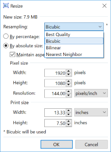
We mentioned earlier that another use of bicubic interpolation is to stretch and shrink an image by an arbitrary amount. My favorite graphics editor is the awesome Paint.NET If you run Windows, this should be your tool of choice too!
To the left is the re-size dialog for paint.net showing the resampling options. All three options available are ones we talked about.
When scaling up an image by a non-integer scale factor, each pixel in the destination image has to appropriately blend combinations of source pixels. Bilinear scaling would only weight the destination pixels based on the percentage of that source pixels that combine to make it. Bicubic produces slightly better results because it uses the points outside to help judge the gradient, as above.
Damping motion


If you've ever written a video game, or generated animations (or transitions/movements in presentation tools such as Powerpoint), you'll know that motions look more natural when they smoothly start and stop. After all, in real life, objects have mass and inertia and don't instantly change from rest and instantly accelerate.
The techniques described above can be used to smooth and even 'damp' movements and interpolate. We'll also look at the math of a couple of other interpolation techniques which, like the half-cosine, aren't used in cameras because they are symmetrical (and thus generate an mid-point that is just the average).
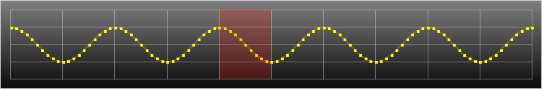
First a demonstration. In the animation below, we are shuttling a box backwards and forwards from one side of the screen to the other.
Remember, our goal here is slightly different. In the interpolation below we're trying to smooth out motion and provide some acceleration and deceleration. When we were interpolating in images we were trying to fill in the gaps naturally.
Notice how all the blocks arrive at the ends at the same time, but travel at different speeds?
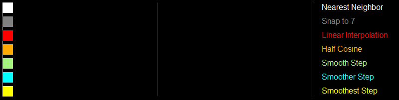
The first row uses the nearest neighbor technique; when the desired coordinate is closest to the left it gets snapped to the left, when it is nearest the right, it gets snapped to the right. It jumps backwards and forwards and is quantized to just these two positions. It's not very elegant.
We can improve this by increasing the resolution of the snapping (as an example as shown on the second line which quantizes the position to one of seven points), but it's still jerky.
The third row is a linear interpolation. Here the block has a fixed (constant) velocity, and moves the same amount each time step. When it reaches the end, it instantly inverts direction, and returns the opposite way with no deceleration. It's certainly better than the first row, but is very basic motion, and a graph of displacement would look like a saw tooth.
The fourth row follows a cosine approach. It accelerates to the midway point, then slowly decelerates from this point to the opposite side of the screen (This is the same motion that the shadow of a circling pendulum would cast, or the horizontal motion of a child on a playground roundabout, when viewed from the side).
The fifth, sixth, and seventh rows show various versions of the Smoothstep algorithm, colloquially know as "smoothstep", "smootherstep", and "smootheststep" alogrithms (we'll derive them later), but the first is a third-order function, the second is a fifth-order, and the third is a seventh-order polynomial.

Graph
Here are graphs of the these functions. The x-axis shows the time period, and the y-axis shows the displacement.
In the first graph is the Linear interpolation, and the Half Cosine interpolation.
In the second graph are the various versions of the smoothstep algorithm: Smooth Step, Smoother Step, and Smoothest Step.
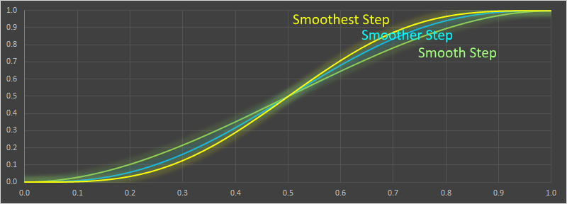
Derivation of Smoothstep
The smooth step family of polynomials are similarly easy to derive. First we'll look at the third order version, called simply "smoothstep" (The first order smoothstep, is just the linear interpolation). All these functions in this family are odd order polynomials.
As before, here is the equation, and the first derivative, of the third order normalized polynomial:

We know the point needs to pass through y=0 at x=0, and y=1 at x=1. We also want the gradients to be zero at x=0,x=1.

This gives four equations and four unknowns, allowing the coefficients to be determined.

And this gives us the formula for the third order smooth step function! Sometimes you see it written in the format below (potentially saving a couple of multiplication operations, depending on how good your compiler is!)

Using the same process, we can calculate the fifth order polynomial. Here, in addition to setting the first derivatives to zero at the end points, we also set the second derivatives to zero. This gives six equations and six unknowns.

This allows the coefficients to be determined:

Here's the formula for the seventh order smooth step (which is commonly called "smoothest step"). To get the extra two equations we set the third derivatives at the end points to be zero.

In reality, however, there's no reason to stop there, we can produce an arbitrary large odd-order polynomial. Here's the 13th order one!

300th blog post
This article is the 300th post of on my DataGenetics blog!
I've enjoyed writing all of these articles. I hope you've enjoyed reading them, or, even better, have learned something from them and have been inspired to research more, or write a little code on the side to experiment with.
If you've missed some of my earlier articles, you can find a complete list of all of them here.
If you don't want to miss out on future postings, you might want to consider subscribing to my newsletter, RSS feed, or Facebook page.